Table of Contents
When I first heard about the Surface Duo last year, I’ll admit that I was intrigued but also skeptical. I didn’t really understand what I would actually do with phone that folded closed and had no use in that position.
It wasn’t until I saw Microsoft’s demo a few weeks ago when I said to myself, “Wow, this is something I could actually use”. The multitasking ability is something that I’ve been missing with my handheld and having a second independent screen looked like a way to improve that. So I went ahead an preordered one.
Sadly, this is not the Android I was looking for. Granted, it’s an amazing device with quite a few features that are unlike any other device out there. But it just misses the mark for me on the software side and feels more like a beta launch to me.
Frankly, I don’t have the time or patience to deal with this many bugs on a device that I use so frequently throughout the day. After just a week, I’m already considering returning it. I can see how this device could still be useful though…to a certain group of people. It’s just not for me yet, and I’ll explain why below.
Design
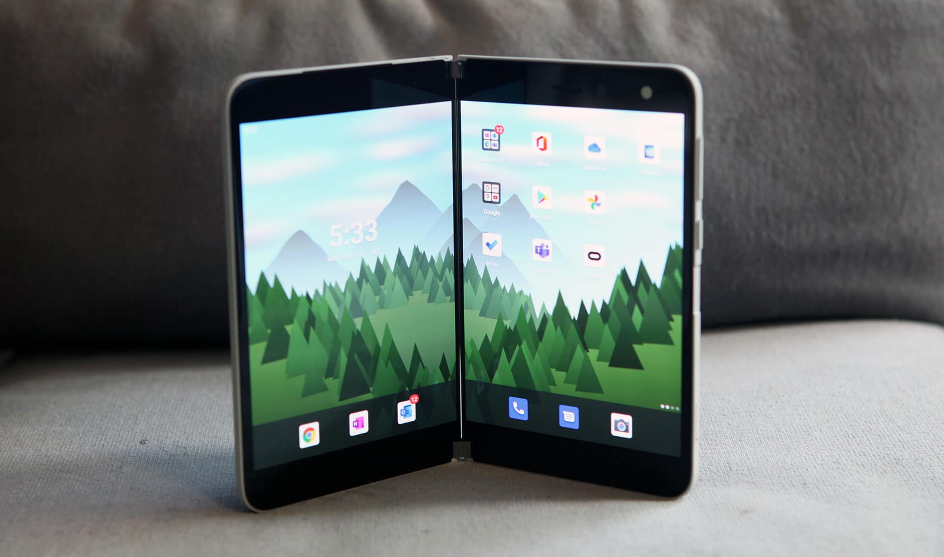
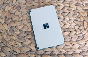
This is the part that initially won me over. The design of the Surface Duo is really cool, being the only “phone” that folds 360 degrees from shut to open and has two independent screens. Sure, the Galaxy Fold has always been interesting to me, but the Surface Duo takes the cake because it actually looks like something I’d want to carry in my pocket.
The build quality backs up the design too. When I took it out of the box and handled it, it felt like a small premium device. And the hinge? Perfect. Microsoft has a lot of experience with hinges, and it shows here. Opening and closing the device is just what I would expect it to be, and there’s even a satisfying resistance when you close the device.
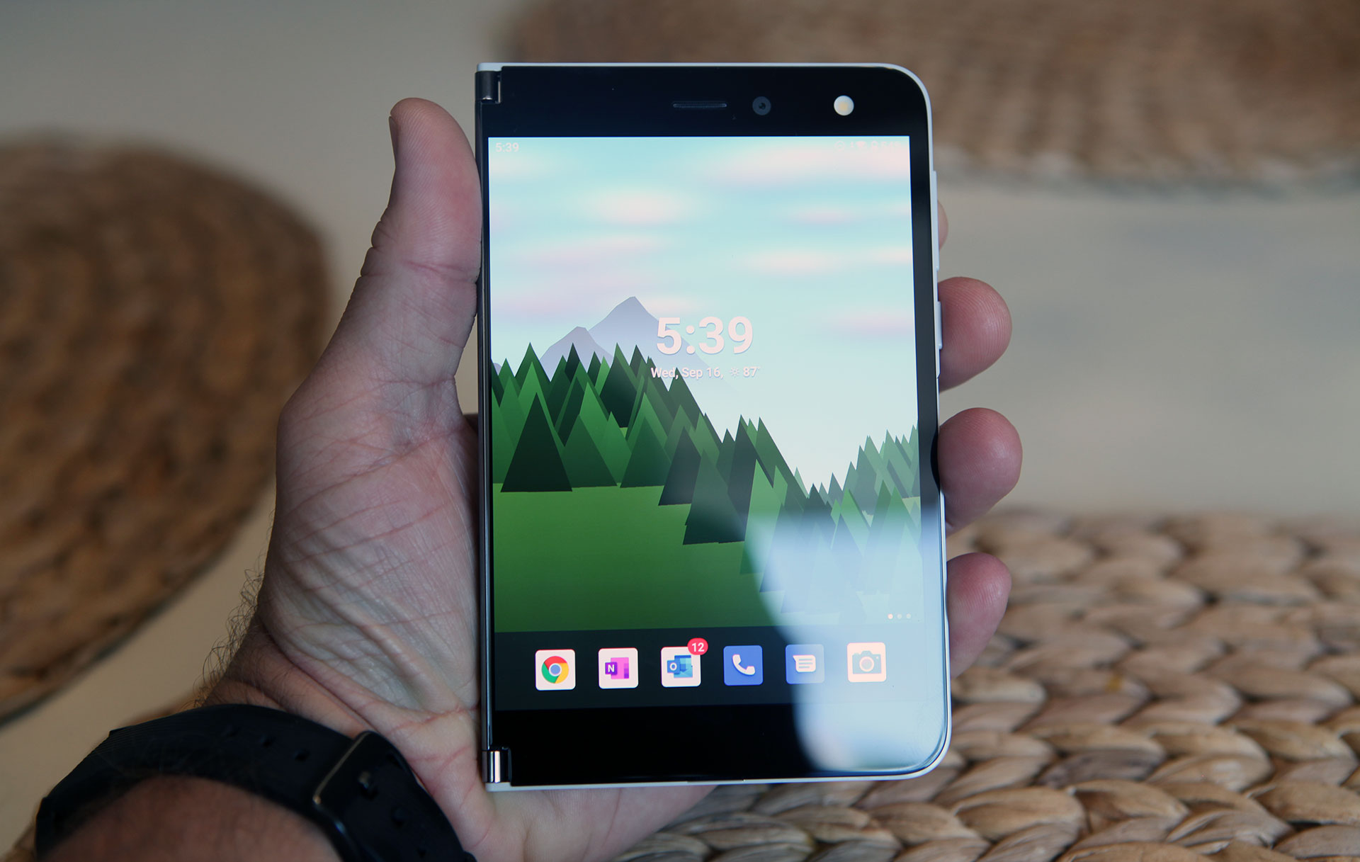
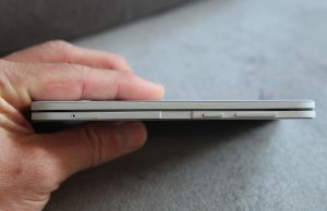
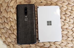
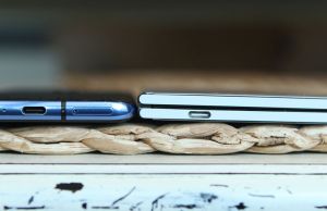
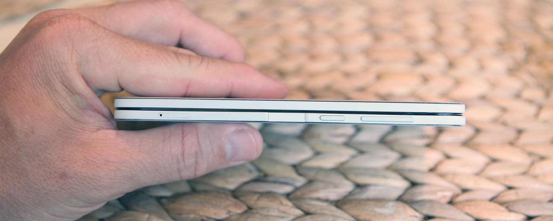
What really impresses me is just how thin it is. Even closed, it’s only a tiny bit thicker than my OnePlus 7 Pro. And when I first unfolded it, I was in awe of how thin it was and yet still felt sturdy. With all my handling, I didn’t feel like I would break it because it was too thin. But that doesn’t mean it isn’t delicate.
Truth is, it’s almost completely covered in glass, open or shut. Yeah sure, it’s Gorilla Glass 5 – I get it. But marketing aside, glass is glass; and if you drop this thing on concrete or a tile floor, you’re going to have more than just one panel to fix. You may end up with all four panels cracked, and I can’t imagine what that would cost to repair.
And thus, Microsoft includes a silicone bumper with the device. I personally find it kind of ugly, but then again, aren’t all phone cases? It gets the job done though and adds a raised edge all around the perimeter, making you feel a little more comfortable with laying it on a desk without scratching it.
I opted not to use my bumper though, mainly because you have to make a conscious decision whether or not to use it, right off the bat. The bumper is held on with an adhesive, and I’m not sure if you’ll be able to get it back on again when you decide to remove it once.
Screen and daily use
Getting back to the design, let’s talk about those screens. They’re actually pretty nice – both identical in size, resolution and brightness. I’ve read reports that some can tell the difference between the white point on the screens, but that’s not the case with my unit.
The screens look just like any other premium smartphone, being AMOLED, very bright, and good color gamut. The only thing missing is that they are limited to 60Hz refresh rate. With all the other flagships being 90+Hz, I feel like this is kind of a letdown.
At first, the bezels didn’t bother me. But after a few days, they definitely started to make the device look a little dated. It also restricts the aspect ratio to being 4:3 instead of the preferred 16:9 or 19:9 that you see on most other devices.
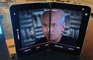
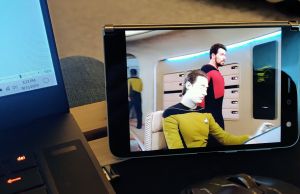
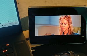
This is especially apparent when watching movies. Unless you’re watching Star Trek reruns, you’ll hardly ever take advantage of the full 5.6” of real estate. When watching many movies, it fits to the equivalent of a 4.75” screen, unless you zoom in and cut off the sides.
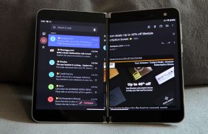
You also have the option of panning apps across both screens, but I hardly found that useful. It’s still a 4:3 aspect ratio. Also, the gap between the screens is treated like lost real estate, so if there’s any text in the crack, you can’t see it. If you’re using the Disney+ app for example, you can’t even see the play/pause icon in the middle of the screen.
The hardware buttons are all lumped on one side of the right-hand screen. Volume buttons are on top, with the power button right underneath. There’s also a fingerprint scanner right below the power button. Further down the right edge is a Sim tray and the USB-C charging port is located on the bottom edge. Other than that, the rest of the edges are perfectly clean.
The fingerprint scanner is nothing to write home about. It works, but it wasn’t always registering my thumb as fast as I’d like. It’s so stinking small that it’s only detecting a thin strip of my fingerprint, so you really have to move your thumb a lot in order for it to detect the part that you initially registered.
There is a fix, but boy, what a compromise. To make it work every time, I registered my same right thumb as 5 different fingerprints. After that, it opened every time and relatively quicker.
I still find the fingerprint sensor on my old phone faster, but that’s only because I can wake the device with the thumb scan (which is very large and integrated on the screen). The Surface Duo only wakes when opening, unless you already have the device open and off. And in that case, there’s a good second before the screen turns on after a successful thumb scan.
The speakers and microphones are not a highlight of the design, by any means. To be frank, they are just oddly placed. The main speaker that you’ll hear system sounds and media from is actually on the top of the left screen. There’s also a microphone integrated with it. The speaker on the right screen is actually for phone calls only, and the microphone for that is located at the bottom center.
What this means is you need to be using the right screen when making your phone calls. But when watching movies, it’s better to use the left screen, since that speaker will need to face you. You can still hear it when it’s facing away, but why would you want the volume to go towards everywhere but towards you? And yes, this means mono sound…
Quality control is going to be a big deal on this device. There’s a lot of adhesive being used to keep this glass attached. And all of the glass is raised, so I can certainly see the possibility of unevenness in the glass gaps. My unit didn’t suffer from this, but others online have reported imperfections in the glass.
Also reported are crooked fingerprint scanners. Mine slightly had this but I never would have noticed without looking carefully. None issue for me. But I did have a blemish on my plastic border, which I noticed right away when I opened it. It’s not a blemish I would expect for such an expensive device.
So that just about covers the physical design (camera will be covered below). I’d say that I’m pleased with it as a whole, but there are some major sacrifices you need to make in order to deal with having a phone of this nature. I guess it just has to be this way in order for it to be so thin though.
Keep reading though, because this isn’t the point where I started to give up.
Hardware and Performance
The Surface Duo uses the Snapdragon 855 CPU and has 6GB of onboard RAM. I can live with the CPU, since I have the exact same one on my Oneplus 7 Pro and it still works fine. I think they skimped on the RAM though. 6GB just isn’t enough for it to perform as a multitasking “solution” in my honest opinion.
My Oneplus has 12GB of RAM and is noticeably smoother when switching between and running apps. And since the Surface Duo is running apps simultaneously in many cases, more RAM is important to have on hand.
Software bugs aside (that’s in the next section), the Surface Duo performs reasonably well in most cases. I did experience some lagginess, especially when using two apps at once. But it wasn’t horrible. The benefits outweighed the consequences in those cases.
One thing that certainly helps is to unlock developer settings and reduce your animation scaling and transition to .5x speeds. This basically cuts all transitions from closing and app switching in half and gives the displays fewer images to process. Tbh, you should do this with all phones – I do.
The screens were mostly covered earlier, but they are 1350 x 1800 resolution, if you were curious. AMOLED, 60Hz, full gamut and Gorilla Glass 5. Do I need to mention there are two of them?
The battery is 3577mAh, which is actually pretty decent considering the size of the device. It’s split across both sides of the device, but is connected as one. No, I wouldn’t have wanted a thicker device in order to have better battery life – this device is the ideal size in my opinion.
I really can’t say much about the battery life except that it has lasted me the whole day. It doesn’t say much though, because I truly feel that I have used my phone a little less than normal, just because of the inconvenience of having to open it all the time. There was one day where I left it folded open the whole day and it lasted just fine – so there’s that.
The UBC-C supports fast charging, but is limited to 18W. This is a little behind the competition and even more so that they omitted wireless charging from the design.
The camera is probably the biggest sacrifice you’re going make, if you decide to make the Surface Duo your own. Truth it, it’s not that good. It’s only 11MP which is far less than most of the competition out there. It’s good enough for a selfie cam and merely just adequate as your main shooter.
In normal lighting, it takes decent shots. I think the colors could be better, but the overall quality of the image is decent at least. But in low lighting, the pictures are not good at all. At all…
I guess I’ve been spoiled by good cameras or decent image correction software, because this one has neither and it shows. The last time I was taking pictures with these limitations was probably with my Moto X in 2014. Interestingly enough, that camera had similar specs.
I also found the antenna to be pretty weak on this device. At work I was getting 1 less bar than I did on my Oneplus phone. It’s tough to judge by “bars” but I did drop a couple calls, which hardly happens with my other phone.
At home, it was way worse, because I hardly got signal at all. I even have a signal booster at home, so I don’t know what to make of it. Either my phone is just incompatible with the indoor antenna or the antenna on this phone is just not strong at all. And without Wi-Fi calling, it’s just not good enough to me.
For reference, I’m on Verizon.
All these hardware features are most likely limited by the size of the device. This is especially so for the camera, as this is the first phone in a long time that I didn’t have to have a camera bump, and the device is incredibly thin as it is.
So it’s a trade-off on form, but considering the overall cost of the device is so high, it’s a hard pill to swallow, with all these compromises. And I haven’t even gotten to the fun part yet.
Software and Usability
There’s a lot of different ways to use the Surface Duo. The way I started was to keep the device closed at all times while not using it. In a way I kind of like it because it adds to the novelty of the device. It also protects the screens, which I’m super paranoid of scratching or breaking – especially since it’s impossible to add screen protectors to this device.
Like I mentioned before, I came to a point where I was using my phone less and less, mainly because it was such a hassle to pull it out of my pocket and open it, merely to check my notifications. I found myself using my smartwatch a lot more, but even that is limited on what it can do.
So then I spent some time using the phone folded open all day. Paranoia of scratching the screens aside, I liked this way a little better. It was easier to pull out of my pocket and just use. It also lessened some of the bugs I encountered while just needing to use the phone in single screen mode.
So how it works is like this: when you open the device, the device defaults to using two screens. It’s only when you fold the other screen into an angle where it decides you don’t want it that it will turn off the second display. If you want to switch displays, simply flip the device over and double tap the other screen. It “should” switch the app to the other screen.
I say should because it doesn’t always work for me. One of the many bugs that are plaguing this device. But I’ll get to those shortly.
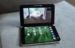
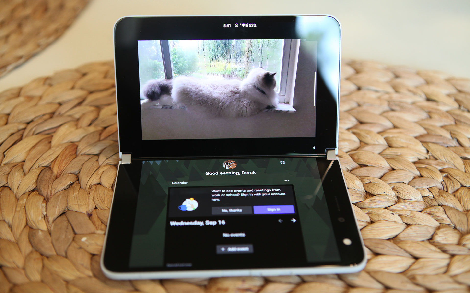
Another mode I enjoyed is laptop mode. This is where the bottom screen is laying face up and the top screen is angled. I used this mode frequently for watching videos.
It’s also useful for typing as many apps will send the keyboard to the lower screen while in this mode. So you get to enjoy a full landscape view of Chrome in the upper screen, with the keyboard completely out of the way. You can even pick up the lower screen for easier typing. It kind of reminded me of a Nintendo DS in this mode.
Besides Microsoft’s core apps, which are great, there weren’t many other apps that are optimized for panned dual-screen usage. Kindle was pretty cool because now it looks like a real book with one page on each side. I found it very easy to hold the device with two fingers at the lower hinge.
But other than that, the only thing I was really doing in Portrait mode(or book mode) was multi-tasking. And this is where my frustrations really started to kick in.
First off, if you’re getting this phone now, my first bit of advice is to spend a good hour playing with gesture navigation or else just turn it off. They are super frustrating and here’s why. With gesture navigation turned on, there’s no nav bar. There’s merely a gesture bar at the bottom of the screen, which is really low profile and stays out of the way. Not bad so far, right?
Swiping up from the bottom acts as a home button, which is pretty natural to both iOS and Android 10 users. Even opening recent apps is pretty easy, which is swiping up and holding for a second. It’s the back gesture that is troublesome though, which requires you to swipe from either the left or the right of the screen.
And the reason it’s from either side is simple – if you’re on an app on the right screen and want to swipe the left edge, you actually will touch and scroll the left screen, most likely. So swiping from the right side on the right screen and swiping from the left side from the left screen is the best way to use the back button action.
But when you’re in landscape mode, it’s different. Once you rotate, the nav bar will move to the right hand side of the rotated screen. So swiping from the right side now will actually cause a home action. So for both the upper and lower screens, only swiping from the left will cause a back action. Confused yet? You actually get used to it but it takes a while.
But once you get used to it, you realize something missing. With swiping from the left being tied to the back action you completely lose all swipe from the left functionality for all apps. Remember the slide-out drawer that could be opened on your favorite wiki or forum app from a left swipe? Well you’ll need to remove that muscle memory and revert back to hitting the hamburger icon instead, because it’s now broken.
My first instinct after dealing with all this was to disable navigation gestures. By doing this, you get the standard three-button navigation like you do in Android, only you still can still switch apps from one screen to another using the gestures. For a while, I thought things were good because the slide-our drawer gesture was restored for all my apps. Everything was good until I played my favorite game.
The trouble with the three button nav bar is that it’s not persistent when it comes to full screen apps. So it auto-hides when not in use. Normally that’s ok, but this navbar is ultra-sensitive and tends to pop up randomly when I touch the screen. So with one of my favorite games, it kept appearing randomly and overlayed it on top of the bottom portion of the screen, covering some of the functionality. Unacceptable and annoying…
At that point I gave up and am now back to using navigation gestures. It’s fine, but I have to deal with the loss of left swipes on a lot of apps. Hopefully the next patch resolves these problems.
After a few days with navigation gestures though, I’m still not fully used to it. I mean, I’m better for the most part, but I still make mistakes a lot. I’m randomly sending apps to the other screen, instead of closing them. And when I mean to send them to the other screen, sometimes I close them.
To make it even more frustrating, sometimes I just plain can’t close an app. Usually, it’s full-screen video, but sometimes I just have to rotate the device or cycle the screen power in order to get the phone to respond and let me close an app.
But that’s not all the issues I’ve been having with the software. There are a lot more annoying bugs that seem to have no particular cause. Rather than try to sort through all my thoughts, I decided just to make a section where I describe them specifically (in the next section) and leave it at that.
Needless to say, if there’s a reason to avoid this device, these bugs are it. It’s a tough pill to swallow when you spend $1500 on a device and it’s full of bugs that make it borderline frustrating to use sometimes.
But if ignore the bugs for now and concentrate on the positives, there’s a lot of nice things to be said about the functionality of the Surface Duo. If all the issues ever get resolved, I think Microsoft is really on to something.
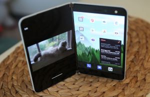
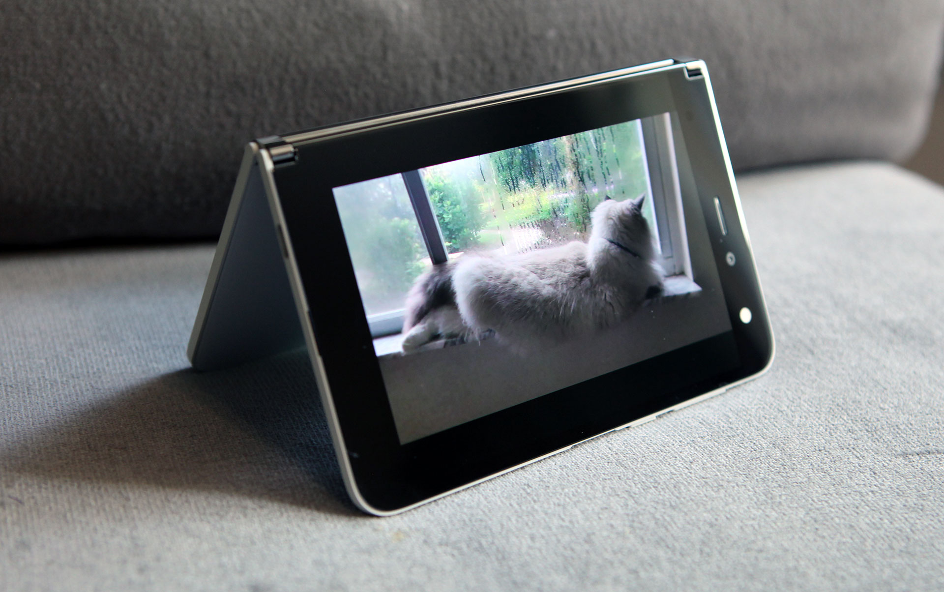
Let’s talk about tent mode for example. When it works properly, it’s extremely useful, especially when you want others to watch a video without having to hold the phone in your hand.
And in that handheld landscape mode, I find it extremely useful and productive to be able to type stuff into Chrome while watching a Youtube video on the screen above. Even being able to watch a movie while I do some internet research is a nice perk.
The last thing I want to cover is the camera which is probably the most irritating software to use that already produces underwhelming results. Truth is, I commonly found it a struggle to use.
Your typical instinct is to open the camera app either on your launch bar or in the app drawer. Depending on what screen you launch it from is where the app will launch. So if you want a selfie, open it on the right screen and if you want to shoot a picture of something else, open it on the left.
Unfortunately, this isn’t as easy if you just open the camera app, fold your phone back and then try to switch sides. There’s only one camera, so there’s no “switch camera” button. So if your camera is in selfie mode and you want to switch it to the other side, you have to hold the phone where the camera is parallel with the floor and hoe the other side gives you the option to switch app sides. And even then, you have to hope it works. Ugh…
The better way to solve it is to turn off the screen with the power button. Then hold the device normally with the side you want to show the camera view from and double-tap the power button. This quick launches the camera and you should be all set.
I can’t tell you how many times I missed a good shot because of how finicky this camera app is. If you have kids, this is not the device you want to be taking pictures with, on the fly.
The last thing I want to mention is a bug that may be limited to just me. For some reason, I am unable to connect to Wi-Fi while I’m at work. I called Microsoft about this and they said that it was something with the way my IT dept set up Wi-Fi.
I’m going to call BS on that though. Not only does my IT dept not know what the problem is, I’ve had probably 12-14 Android phones over the past 11 years and they all worked just fine. The only exception was my HP Touchpad that was running a custom Android Rom, which struggled with Wi-fi in the same manner – but it was software related.
So that pretty much put the nail in the coffin for me – I can’t use Wi-Fi at work…
Other Bugs, Gripes and Frustrations
Rather than try to integrate all my issues into a cleverly worded review, I decided to bundle my leftover observations here instead. Truth is, there were just too many and I didn’t want to leave anything out in order to make things flow better.
–Mono Speaker – There’s only a single speaker on the device. When using tent mode or single screen, it’s either pointing at you or away from you, so you have to choose wisely what screen you want.
-Auto rotate – Sometimes when trying to watch a movie, it won’t auto-rotate correctly when in “laptop mode”. I’ve found that it happens most frequently when the other screen is on the far left page on the launcher(the page that has your calendar, tasks, recently used apps, etc). The only fix is to close the app and reopen and try again.
-Full screen video – Frequently, I watched full-screen video using Netflix, Disney+ or Youtube. With gesture navigation enabled,, I sometimes found it impossible to close the app that was playing the video. The home gesture would simply do nothing and there was no way to close the app. The only way around this was to either turn the screen off and on, or rotate the device 90 degrees and back again. Then the home gesture would function properly.
-Loss of active app – When using an app in dual screen mode and then folding the screen back to use single screen mode, you’d think the active app would appear on that screen. But that’s not always the case. It would only show you the content that was on that screen when you folded it. For example, on screen 1 would be Netflix, playing a movie. On screen 2 is nothing. I fold the screen back to display only screen 2, but all I see is my app launcher. Meanwhile, Netflix is playing in the background. The only way to get to it is to flip the phone around and double-tap to wake the screen.
Tent mode – Tent mode is great for showing videos and content to others. The trouble is if the screen is on the wrong side, particularly the side that doesn’t have the speaker, you’ll find yourself wanting to switch it back to the other screen. But in this mode, it’s not so easy to switch screens. In tent mode, the other screen is completely off and is only available for switching when the active screen is parallel with the floor. Not intuitive at all! Once you do this, you can double-tap the other screen to move the video to the other side. A better solution? Fold your screen completely back and hold it where the speaker side is up. Open your app and video, then open the tent and stand it up.
Recent apps – In navigation gestures mode, there’s no way to open your recent apps up without opening an app(any app). By doing this, the nav gestures bar appears from the bottom and you can swipe up and long hold to open the recents menu. A simple fix for this is to disable navigation gestures, but it comes with a price of having a randomly appearing nav bar that frequently gets in the way of some apps(it’s not persistent and unhides all the time).
Apps won’t close – Sometimes an app just won’t respond to navigation gestures to close. I noticed this with videos a lot(Above)! But there were other times it happened with apps too. In some instances it would work after a few attempts. But the sure way to get it to work is to cycle to standby and back. Another way that worked most of the time is to open the phone to dual-screen and rotate it, but sometimes even this didn’t work.
Panning across two screens – Your instinct is to try this with a lot of apps, but prepare to be disappointed for most of them. Until dual-screen phones become popular, it’s going to be a hard ask to get devs to support it with their apps. Most of them likely won’t have a dual-screen phone to test it with and I don’t believe there’s an easy way to do it via software. Until this is fixed, every app you try to pan is going to have a gap with missing pixels between it.
Price and Availability
The Surface Duo is available on the Microsoft Store and at Best Buy. The 128GB version is $1399 and the 256GB version is $1499. Considering there’s no expandable storage and you’re already spending an absurd about of money for a phone, you might as well get the 256GB version.
For the pen, you have some options. You can get the Surface Pen for $111 on Microsoft’s website, or you can settle for a lot of cheaper alternatives. My favorite is the Bamboo Pen, but there’s another even cheaper alternatives available on Amazon as well.
Final Thoughts
I can’t say it’s been a blast trying this gadget out. Normally I’m all over new ground-breaking technology, as I was first in line for the Asus Transformer tablet and AiO and have been part of dozens of Kickstarter campaigns in the past. But that’s the thing – this feels like I got something from a Kickstarter, but paid premium prices for it.
I just feel that Microsoft could have done a better job optimizing the software and maybe this was released too soon. But judging from the dated specs, maybe this launch is just extremely late and they just had to get their units out the door before they became even more obsolete.
I think part of the blame is Android too. It’s not exactly made for dual-screen operations. But we can’t really blame Google. After all, they and Microsoft are competitors, right?
The phone is still only a week old though and perhaps Microsoft will be able to clean up some of the software messes with some patches. They did mention monthly updates and perhaps Android 11 will fix some of the issues I’ve been seeing.
But software issues aside, this is a very expensive device and has some merely average hardware specs, save for the second screen. What you’re really paying the big bucks for is the form factor, which for the time being is one of a kind.
So that’s what it all comes down to – is this phone going to benefit you? I think that if you are constantly switching between 2-3 apps on a regular basis, have the patience for MS to work out their buggy software, and don’t care about being able to take good pictures, maybe it’ll work for you.
But for most others, I’d recommend that you pass on this model and wait for the next one. Or better yet, wait a few months and buy one of the hundreds of open box/refurb sales that are about to hit the market. I have a feeling MS is going to get a lot of product returns in the next couple of weeks.
For me, I’m definitely going to pass on this model. There’s just too much of a downgrade coming from my old phone, including but not limited to lousy camera, weak reception, less RAM, slightly less battery, slower charging, slower screen refresh, mono sound, loss of Wifi calling. And oh yeah, $1500.
If it wasn’t for the software bugs, perhaps I would have given it more of a chance. But because of that, I truly think that we’re the beta testers here and there’s a better value solution coming in the short future.
That all said, I really do think Microsoft is on to something here and this could very well be the future of phones. With better software integration and some better hardware specs, I’m totally on board with this as my next phone…provided the price is reasonable.
I mean, when I tolerated the bugs, I really did like it. Really. I can totally see myself using this device on a regular basis. But in order for that to happen, it either needs to be polished, or half the price. Better camera software would help too.
But hopefully, we see some more teaming up with Google and Microsoft on the next design. Perhaps even reviving the Nexus partnership to do so? I fear without Google supporting a second screen as part of the OS by default, this idea will never fully take off.
I would love to hear what other Microsoft Duo owners think of their devices so far. If so, please leave a comment below. I’ll have mine at least another week if anyone has any more questions.




John
September 18, 2020 at 10:04 pm
I have had my Duo for 10 days now and love it. Agree on the camera critique, and I but I haven't had anywhere near the bugs you report. I am Always in 2 apps and love the 2 screens. I actually feel more productive on the Duo then on my recent Galaxy Note 10+. This is first non-Note phone I have in years. The Duo syncs seemlessly with my Surface Pro using the Your Phone app and make quite a pair.
Anonymous
December 18, 2021 at 10:40 am
Hi, great article!
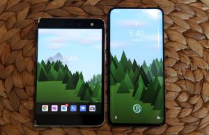
Is that mountain wallpaper included with the phone? Where did you get it? It looks so good!
Derek Sullivan
December 18, 2021 at 6:12 pm
Forest live wallpaper. It changes over the course of the day depending on the daylight and weather. I live in FL so the seasons don't really change, but it does that too.
I think it's a paid app but it's worth it. Weird to say, but it's actually one of the few things I really miss about Android since I switched a few months ago.
Anonymous
December 19, 2021 at 4:25 am
Thank you for the fast reply! Yes, it really is one of the best looking designs out there. It is very reminiscent of the Microsoft Windows XP wallpaper with the valley sky. This is a great idea for Microsoft to trademark. Like a window to a beautiful valley. Anyway, thanks for the great idea Derek Sullivan!
Pritos
February 13, 2023 at 5:52 am
I've been daily driving the Surface Duo since January and it is good. I got it brand new from Amazon for $300. If you got yours for $1000+ then you were scammed. Other even got the Surface Duo for $200 during sale. Even the Surface Duo 2 only costs around $999 now. Battery life is good as well which surprised me. There are still some bugs and the version of Microsoft Launcher installed is lacking a lot of features. Media consumption and gaming is good for an old device. You may have gotten a lemon unit with the experience you got from your device. My Surface Duo is the perfect device for my use case given then price point. All in all, the Surface Duo is a good device now though the first impressions before left a bad taste in the mouth. I hope Microsoft creates another Surface Duo with updated specs & no camera bump and affordable. The Surface Duo 2 is too expensive now but if the price dropped around $300 as well, I would get one. Availability of the Duo 2 is a problem as well. I think the Oppo Find N2 is the best inspiration of the next iteration of the Surface Duo.